1994: KFC Cambridge, NZ
When KFC came to my small town in the mid 1990s it was a big deal. It was our first fast food restaurant, and naturally took pride of place on the main street just down from the town's earlier place of worship from a less secular era, St Andrew's Church. It was a prime location, with both large local and transient markets.
KFC expanded rapidly in New Zealand during this time and became a ubiquitous feature of the landscape. Your town or neighbourhood had 'made it' if a KFC opened. Consequently it was a source of shame, at least to a teenage mind, if KFC chose to bypass yours for a neighbouring town. In later years, road trip routes were planned according to KFC locations.
2014: KFC New Haven, CT
A Geographic View
Fast forward 20 years to New Haven, Connecticut, my current location. In the birth country of KFC I had expected the Colonel's face smiling from prime locations to be common. But it didn't appear that way. Perhaps I wasn't getting out enough? Or perhaps the mature fast food market in the US dictates KFC be more selective in its location decisions?
I am analytical. So I decided to do some exploratory analysis. I also like maps. So the analysis was a visualisation: a quick map to see where KFC is located in Connecticut. There are 44, according to the data I collected. Interestingly this is roughly half the number in New Zealand, and is a ratio of one KFC per 80,000 people (or one per 113 square miles), versus one per 50,000 (1,130 square miles) in NZ.
This didn't tell me much, without context. I added a thematic grid layer, produced from US Census data, to show relative population density. This produced the following map:
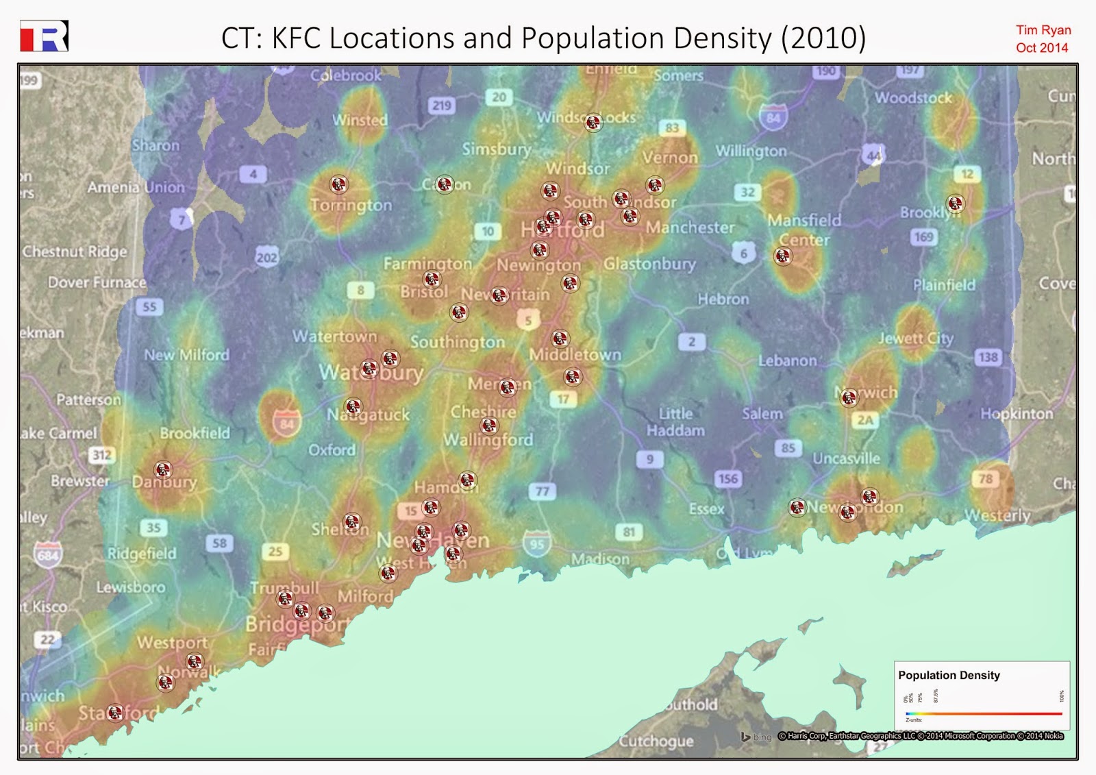 |
| KFC Locations in Connecticut. Background grid thematic shows population density (2010) |
At this relatively high zoom level it appears that KFC generally follows the population density, as would be expected. However, zooming to a lower level, the intra-city variation becomes more apparent:
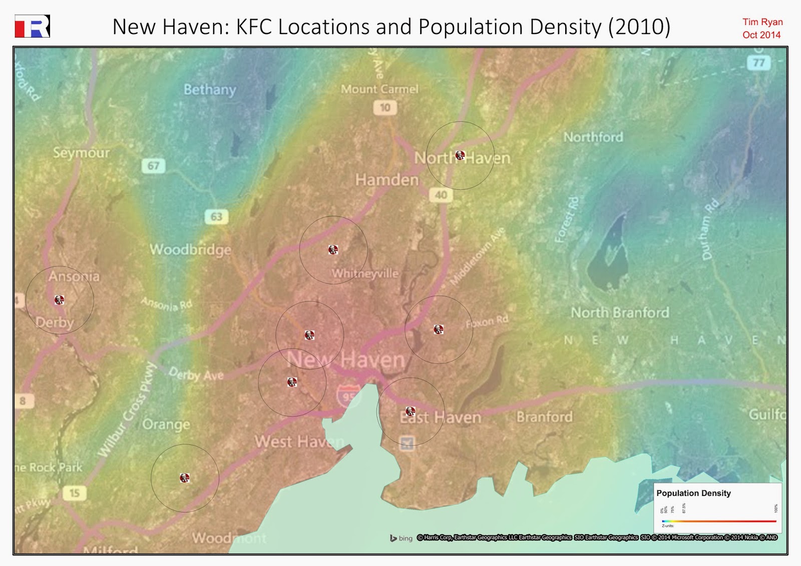 |
| KFC locations in New Haven, CT. One mile radii are placed around each location. The grid layer again shows population density. |
The area I have spent most of my time in is the area between the words 'Haven' and 'Whitneyville' on the map. I wasn't simply unobservant: KFC is notably absent from this area.
A Demographic View
Having advised on site location decisions, I knew that a location-dependent organisation like KFC would use at least some science when augmenting its network. One powerful factor in site location modeling is the demographic composition of a catchment: the income, age and ethnic (etc) profile. Could I infer KFC's neighbourhood preferences from its existing network in CT?
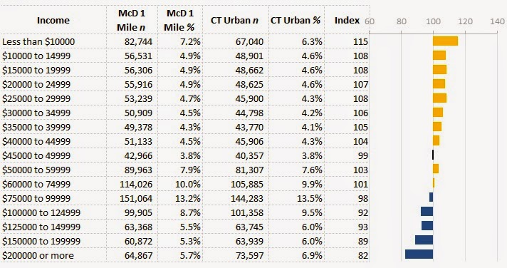
I started by importing the census data - at block group level - into the existing map. I was then able to run a spatial query and aggregate the block groups that fell within 1 mile of a KFC. The aggregated block groups were then compared to the overall state (urban) profile, to produce the following demographic views:
 |
| The income profile shows that KFC is more likely to be found in areas with lower household income. |
 |
| The ethnic profile shows a strong skew toward African American neighbourhoods. |
 |
| The age profile doesn't exhibit any strong skews. |
EDIT: What About McDonald's?
A useful way to understand an enterprise's network strategy is to compare it to a competitor. Let's use McDonald's. McDonald's has a much stronger presence in CT, with over 250 stores. This pervasiveness is likely to reduce some of the demographic skews we see with KFC. The comparison:
 |
| Like KFC, McDonald's also skews toward lower-income neighbourhoods - though not as markedly. |
 |
| McDonald's has a slight bias toward African American neighbourhoods, though it much less pronounced than KFC. |
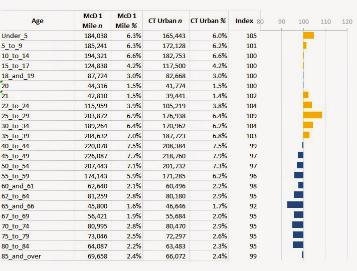 |
| The McDonald's age profile, like the KFC age profile, doesn't exhibit particularly strong skews. |
Summary
From this rough analysis, across a small sample, it appears KFC does indeed favour certain geodemographic profiles. Whether this is by top-down design or bottom-up demand is hard to say without further investigation.
Reflecting back on the map, I also realise that I need to get out (of my neighbourhood) more.
What software did I use? Python to collect the store coordinates and concatenate the census files; MapInfo to produce the maps; Excel to produce the index profiles.
No comments:
Post a Comment