Monday 10 November 2014

Enhancing the Huff Model

Everyone loves a good store catchment illustration. 


Even more so if it is accurate. 

Usually you will want to build a catchment from customer-side metrics, such as spend/visits per address/neighbourhood/suburb. However, these aren't always available - especially when a store is still in the planning stage!

David Huff's 1963 retail patronage model - the Huff Model - has served as a useful catchment heuristic for over fifty years. The model predicts the likelihood of a person in a given location visiting a store, based on a) the 'attractiveness' of the store (relative to other stores) and b) the store's distance from that person (relative to other stores). Typically turnover - or proxies, like floor area or staff numbers - is used as the attractiveness score, with the distance measured as a straight line. The result is a patronage probability grid, like this:


'Naive' patronage probability surfaces based on store turnover (Huff Model)

Because the probability grid operates on straight-line distance, it ignores geographic constraints: rivers, mountains, ocean etc. The Huff Model therefore works best when accessibility is uniform - such as when streets are laid out in a perfect grid. Unfortunately this is rarely the case.


Enhancing the Huff


An obvious way to improve the Huff is to incorporate customer accessibility, by allowing for geographic constraints in the probability grid. 

This can be done by:

  • Creating a polygon-based grid
  • Measuring the distance (or time, preferably) between each grid cell and each store by the road network
    • The road network is, in most cases, the best representation of accessibility
  • Assigning a probability score to each cell based on the time/distance vs attractiveness measurement.
    • The score can be tweaked to represent the distance decay curve likely for the category - such as a flatter curve for a 'destination' location, or a steeper curve for a 'convenience' location. 
    • The probability scores can be calculated in almost any analytic software - even Excel.
  • Mapping the scored cells.
    • The map has two thematic layers. One shows the most attractive store for a given location. The second shows the intensity of the attraction; darker is more attractive.

Result


While the enhanced map (below, left) perhaps doesn't look as stylish, lacking the appealing contours of the naive Huff Model, it is significantly more accurate. For example, in the area below the text 'Sample 12' on the map, the patronage probability has decreased from 0.9 to 0.5. The enhanced road-based model recognises that the harbour creates an impassable barrier, and scores the area on its true store accessibility. 


With a more accurate model, more accurate catchments can be generated. The above process also has the added benefit of retaining all store attractiveness scores within the cells. This means catchment overlap can also considered - important, since catchments are very rarely exclusive.

Drive-time enhanced patronage probability surfaces based on store turnover


Wednesday 22 October 2014

Cell Phone Data as a Population Proxy

The maps below, which I produced in Tableau, show aggregated cellular signals in Wellington (New Zealand) at different times of the day. The data gives a good approximation of human activity, and provides an insight into relative changes by time and suburb.


Traditionally is has been easy to source population data for place of residence, from various databases - either aggregated (such as census), or atomic (such as vehicle, address, property etc databases). It has been harder to source workplace population data, though it is available in some aggregated forms. And it has been impossible to source transient population data on a large scale. 

That is all changing with the explosion in mobile device usage. Now, instead of relying on static data for area profiling and analysis, smart organisations can introduce dynamic mobile-derived data to get more accurate insight into variability by time and day. 

Deeper analysis, into attributes like velocity between time-stamped data points, can separate people who are walking, driving, or not moving. Similarly, geofencing can be used to identify the 'gateways' (eg airport or train station) people use en route to various locations. 

The commercialisation of this data is still at an early stage, and strict privacy must be applied to the phone users' data. However, with telcos increasingly willing to leverage the value of their data assets, expect to be able to supercharge your operational and marketing activity in the near future. 


Tuesday 21 October 2014

Tableau Public: A Dashboard in Five Minutes

Tableau Public is a free variant of the popular data visualisation tool, Tableau. As the name implies, any output produced is public - so don't use it with information you want kept private. That aside, it's a simple-to-use tool for producing quick, effective visualisations to the web.

As a long-time user of disparate data analysis and visualisation products, such as Access, Excel, SAS and MapInfo, it's pleasing to finally see a rapid convergence of these tools. Naturally these hybrid tools, such as Tableau, don't provide the deep analytical power of their more specialised forebears. But they do make visualisation and insight accessible to those without a background in data science. If you're familiar with pivot tables (cross-tabs), then you will find Tableau easy to pick up and run with.

As a new resident in Connecticut with a strong interest in retail analysis and history, I thought I'd look at Walmart's evolution in the state. I used Python to collect the store coordinates and opening dates from Walmart's website, which I saved in Excel. I then imported the file into Tableau Public, identifying the latitude and longitude fields as I did.

A few minutes later I had produced the following (rough) 'dashboard':

What really appeals, beside the simplicity of production and output, is the time-series feature. A user is able to move the date slider in the bottom right corner and observe Walmart's growth over time - both on the map, and the synchronised chart below it. MapInfo, for example, can make much more detailed maps, but to produce a time-series map would require layering multiple images in another tool, such as PowerPoint, or an add-on such as MapInfo Engage.

Tableau Public isn't perfect for every visualisation. But it is effective in many - especially those where rapid, non-sensitive output is required, and data scientists aren't available.

Monday 13 October 2014

KFC in CT: a Geodemographic View

1994: KFC Cambridge, NZ

When KFC came to my small town in the mid 1990s it was a big deal. It was our first fast food restaurant, and naturally took pride of place on the main street just down from the town's earlier place of worship from a less secular era, St Andrew's Church. It was a prime location, with both large local and transient markets. 

KFC expanded rapidly in New Zealand during this time and became a ubiquitous feature of the landscape. Your town or neighbourhood had 'made it' if a KFC opened. Consequently it was a source of shame, at least to a teenage mind, if KFC chose to bypass yours for a neighbouring town. In later years, road trip routes were planned according to KFC locations.

2014: KFC New Haven, CT


A Geographic View

Fast forward 20 years to New Haven, Connecticut, my current location. In the birth country of KFC I had expected the Colonel's face smiling from prime locations to be common. But it didn't appear that way. Perhaps I wasn't getting out enough? Or perhaps the mature fast food market in the US dictates KFC be more selective in its location decisions? 

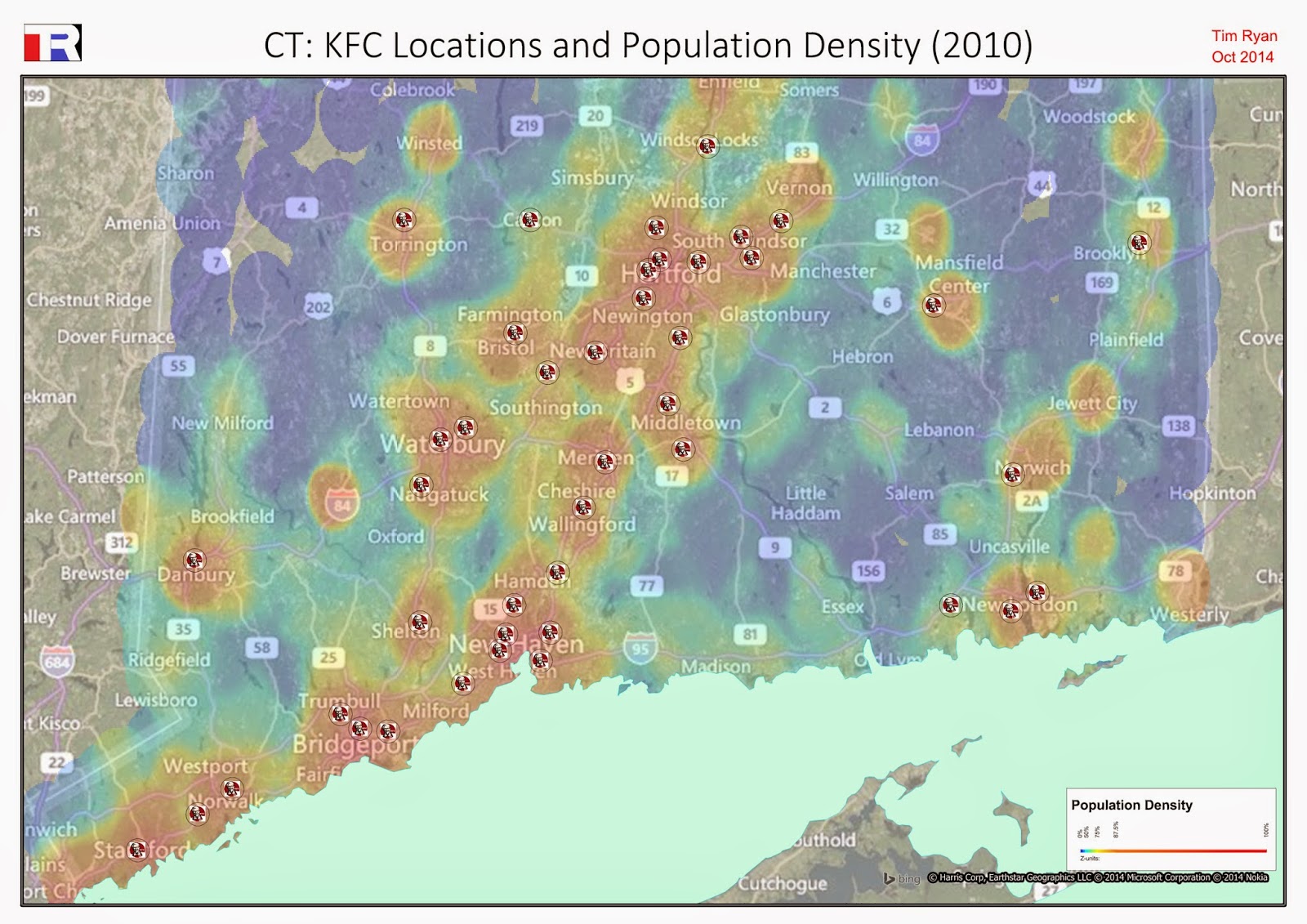
I am analytical. So I decided to do some exploratory analysis. I also like maps. So the analysis was a visualisation: a quick map to see where KFC is located in Connecticut. There are 44, according to the data I collected. Interestingly this is roughly half the number in New Zealand, and is a ratio of one KFC per 80,000 people (or one per 113 square miles), versus one per 50,000 (1,130 square miles) in NZ.

This didn't tell me much, without context. I added a thematic grid layer, produced from US Census data, to show relative population density. This produced the following map:


KFC Locations in Connecticut. Background grid thematic shows population density (2010)
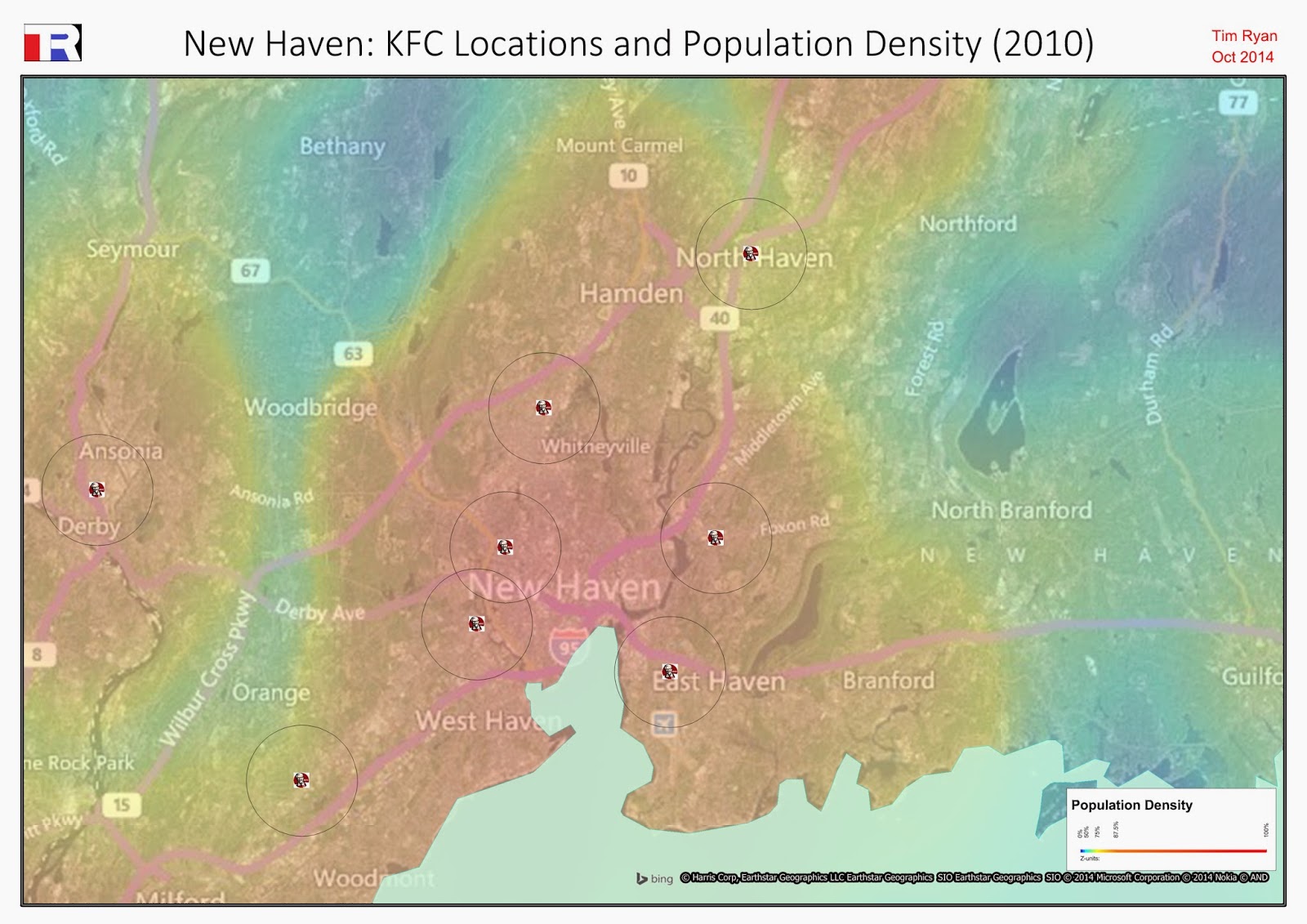
At this relatively high zoom level it appears that KFC generally follows the population density, as would be expected. However, zooming to a lower level, the intra-city variation becomes more apparent:

KFC locations in New Haven, CT. One mile radii are placed around each location. The grid layer again shows population density.
The area I have spent most of my time in is the area between the words 'Haven' and 'Whitneyville' on the map. I wasn't simply unobservant: KFC is notably absent from this area. 


A Demographic View

Having advised on site location decisions, I knew that a location-dependent organisation like KFC would use at least some science when augmenting its network. One powerful factor in site location modeling is the demographic composition of a catchment: the income, age and ethnic (etc) profile. Could I infer KFC's neighbourhood preferences from its existing network in CT?

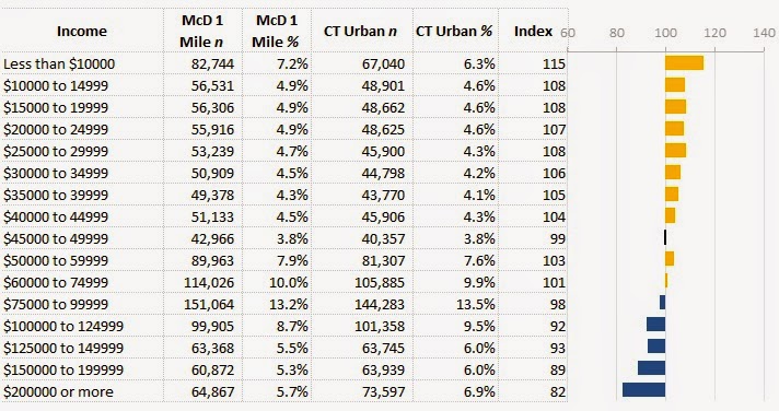
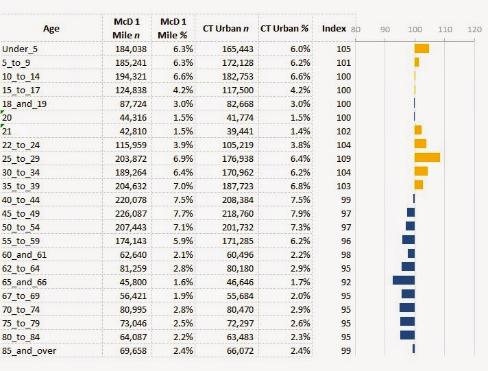
I started by importing the census data - at block group level - into the existing map. I was then able to run a spatial query and aggregate the block groups that fell within 1 mile of a KFC. The aggregated block groups were then compared to the overall state (urban) profile, to produce the following demographic views:

The income profile shows that KFC is more likely to be found in areas with lower household income.
The ethnic profile shows a strong skew toward African American neighbourhoods.
The age profile doesn't exhibit any strong skews.
The demographic views show the strength of each variable, indexed. An index of 100 represents the average; an index over (under) 100 is above (below) average. 


EDIT: What About McDonald's?

A useful way to understand an enterprise's network strategy is to compare it to a competitor. Let's use McDonald's. McDonald's has a much stronger presence in CT, with over 250 stores. This pervasiveness is likely to reduce some of the demographic skews we see with KFC. The comparison:

Like KFC, McDonald's also skews toward lower-income neighbourhoods - though not as markedly.
McDonald's has a slight bias toward African American neighbourhoods, though it much less pronounced than KFC.
The McDonald's age profile, like the KFC age profile, doesn't exhibit particularly strong skews.

Summary

From this rough analysis, across a small sample, it appears KFC does indeed favour certain geodemographic profiles. Whether this is by top-down design or bottom-up demand is hard to say without further investigation. 

Reflecting back on the map, I also realise that I need to get out (of my neighbourhood) more.


What software did I use? Python to collect the store coordinates and concatenate the census files; MapInfo to produce the maps; Excel to produce the index profiles.